

LinkedIn Jobs App Redesign
Project Details
Role: I was the sole designer and led the end-to-end design for both our Android and iOS platform. I worked closely with 1 product manager, 10 engineers, and 1 UX researcher.
Process: Bi-weekly sprints, Bi-weekly check-in with Design and Engineer, and daily standup, Bi-weekly Design-led bug bash
TImeline: Shipped MVP for both Android and iOS experience in 6 months, Release across 16 languages
Background
The LinkedIn Job Search App is LinkedIn's native mobile platform for job seekers. The mobile application allows active job seekers to find and discover jobs while leveraging their LinkedIn network. Members can apply with their profile and manage and receive notifications for their job searches.
Prior to this redesign initiative, I had the opportunity to lead and build the Android app from the ground up. Upon release, we were immediately featured in the Google Play Store and received overall positive feedback from our members with a score of 4.4 throughout the year.
After our successful Android app Kitkat releases (4.4), LinkedIn began to explore a new visual design language. Also, Google began the rollout of their new Android 5 OS with their new Material Design language (Lollipop). With a new two new library and style guide, we made the decision to ensure that our members receive the best experience possible. Since our jobs app ties closely with the LinkedIn flagship app we needed to ensure parity with both our experiences. I was tasked to adopt the latest design language for both our iOS and Android experiences.
Here’s a promotional video for the 1.0 release of the LinkedIn Job Search app on Android.
Overcoming challenges and identifying what’s possible
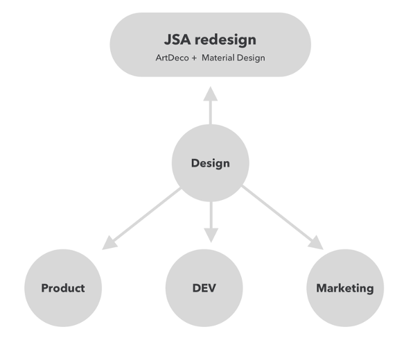
With our existing product feature release cadence and the state of our apps, our teams needed to align on expectations and goals in order to move forward. The product team wanted to continue striding forward on releasing new features in hopes to increase engagement and retention. Design wanted to ensure our compatibility with LinkedIn flagship and Android OS. Development teams wanted to ensure our application was leveraging the latest API libraries.
After outlining different various directions and identifying pros and cons we as a team decided on putting most of our efforts into moving forward with ensuring our app adopts the new API and library for both iOS and Android. This means that Android will move towards the new LinkedIn visual design language (Art-Deco) and Android OS (Material Design). In addition, iOS will also adopt the new LinkedIn visual design language. This decision ensures both our Android and iOS apps are future proofs and our jobs library API works properly with the flagship LinkedIn product.
Since I was the sole designer and we had a 6month plan. The MVP strategy I proposed was for Android we move towards adoption of the new LinkedIn Design Language and Android Material design with two additional new revamp experience of Discovery and job description tabs. While on the iOS I proposed that we update the existing app to bring it closer to the new LinkedIn visual design language this includes typography, iconography, color. In addition, updating the Search home and job description page to create parity with our apps to the most important experiences.
Timeline and Process
Here is a look at the teams that contributed to this project. Note that the timeline includes both the LinkedIn Job Search App redesign and Discovery feature. Also note, in order for our team to achieve the timeline for both iOS and Android both Design and Engineering had to work in tandem. For this project, I collaborated with the Product Operations, Product Manager, Research, Engineering, Marketing, and Design System team.
With a new OS comes a new experience
With the recent LinkedIn product redesign and the update to Android's design library (Material Design), it was essential for us to reevaluate our experience to continue to deliver the best product to our members. Through our members’ feedback, we've learned that they want more flexibility and control over their job search. With the new version, we wanted to make the experience more personalized and effortless for our members.
One new personalized feature in our app was the introduction of job insights. To provide more value for search results and job recommendations. We refer to this feature as "flavors." A "flavor" is an insight for a job listing that is associated with the individual job seeker. This feature helps our members parse through job listings quicker and helps them understand their “value” and "edge" for a particular job.
Here is a look at the process I made to redesign our app with LinkedIn's and Google's material design language.
What we learned from our members
Some of the learnings and feedback we've gathered from our initial release are:
1. Search results are sometimes inaccurate.
2. Our members want the option to manage and save their searches.
3. Job searching requires more effort than just applying for jobs.
We knew that before we could begin redesigning and adding new features we needed to update our app's infrastructure. This decision required us to update our APIs to leverage the latest of both LinkedIn's and Android's library.
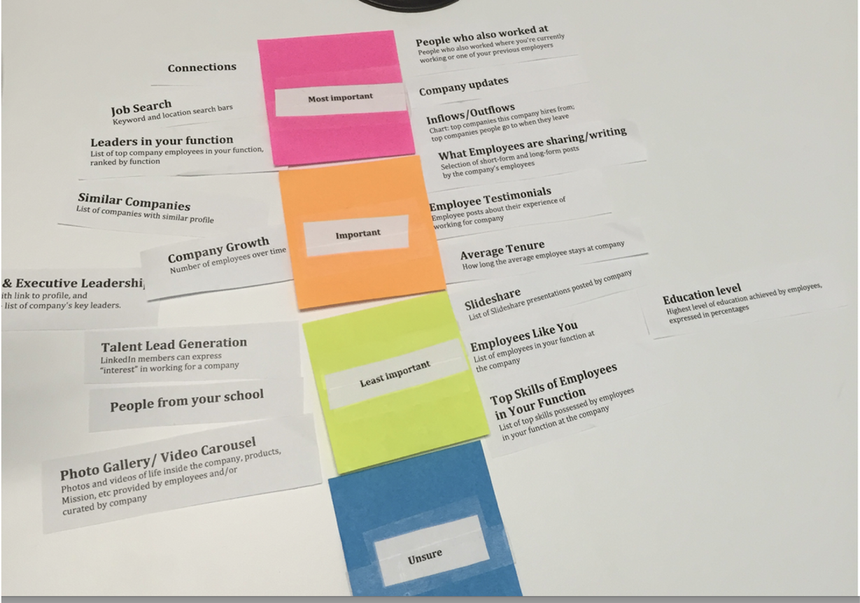
We also had the opportunity to run a card sorting exercise to better understand what’s most important for job seekers. What we found was Job details, Connections, Company, and Location are the most important factors when job hunting.
Entities explorations:
Here are early designs of entity pages (Job, Company, and Profile). With the diverse content and information to parse, I opted for a full bleed design and leveraged Material Design's keyline margins, aspect ratios (16:9), and 8dp component baseline grid. I believe that leveraging these grid rules creates cohesiveness throughout the entire app and across the Android ecosystem.
Here is an early exploration showing the use of persistent (16:9) aspect ratio and material design’s keyline margins across all entities.
Creating a cohesive experience:
Since we knew we would be having our members deep linking between both LinkedIn and LinkedIn Jobs apps, it was essential that both experiences share consistent patterns and components for a cohesive experience.
Profile (Left), Job details (Center), Company (Right). These are examples of entity pages that share components with our LinkedIn flagship app.
Here are some example core screens from the app.
Closing the loop
To design a complete experience, we also needed to consider empty and error states. These are helpful in closing the loop for our members and giving them guidance in moving forward.
Deep linking
To promote retention and engagement back to our app, we defined a variety of channels for deep linking such as notifications, email, LinkedIn mobile web, LinkedIn Student App, and Google Now to ensures that our members receive a seamless job-seeking experience.
Android vs iOS
The approach i decided to take for the app was to focus specifically on the most native experience and true to the platform as possible. This allowed myself and the team to accelerate our work and align closer with LinkedIn flagship app experiences. We also found through our user research we found staying true to the uniqueness of the platform yields the best experience with least amount of friction for our existing LinkedIn members.
One of the key differences between the two mobile platforms are in navigation where our iOS experience has a persistent navigation while we adopted the navigation menu for Android. This difference is especially noticeable with how the two platforms handle the “back button” pattern with Android always having a persistent hard “back button” available.
I leveraged the “FIT” scheme principles to prioritize action on App Bar. “FIT” is an acronym for Frequent, Important, and Typical. These were rules that I contributed back to the LinkedIn Design System team.
Here is an example of the difference in how navigation is handled between the two operating systems.
Communicating the building blocks
During the time when our app was in production, I discovered that our app would be one of the first apps within the LinkedIn mobile app ecosystem to roll out with the new LinkedIn and Android design language. Our team would be responsible for defining how LinkedIn's new patterns and components would behave in the Android ecosystem. As a result, I needed to establish production rules that would scale across all teams and apps within LinkedIn.
Here is an example of how I communicate to my developers on building the apply card component. Note that isp_# is referencing specific guidance to our system spatial units.
This is an example of how the App Bar would behave across different screen sizes.
A look at the various job lists permutations within the app.
Assets and Production
Paying close attention to the pixels for each asset ensures the final product appears consistent across all screen sizes and resolutions. The naming conventions are also crucial to help with organization and ensure that the assets play well within the Android ecosystem. Also, optimizing exported assets ensures proper management of app file size.
Delivery
In 6 months, our team was able to achieve all our MVP goals that include releasing a new redesign of both our Android and iOS LinkedIn Jobs app with the latest library and experience we have to offer. For both operating systems, we now have the ability to use LinkedIn's latest job insights and improved Search and Saved job API. We were also able to adopt LinkedIn’s latest Visual Design Language for both iOS and Android. This also included LinkedIn’s new entity (Jobs, Connection, and Company) page pattern design. This allowed for cohesiveness between our app and flagship and allowed for a more seamless deep linking experience.
For the Android operating system, we were able to revamp the entire application to Android 5.0 with a Material Design and contribute many Android components and patterns back to the LinkedIn Design System. We were also able to release an all-new Discovery feature (View case study).
For iOS, we adopted LinkedIn’s new design language components such as (Typography, Colors, and Icononogry). In addition, we also adopted LinkedIn’s new entity pattern to ensure cohesiveness between our apps.
Results
With the release of the new LinkedIn Jobs Seeker app, we were able to bring our new experience to 16 countries. Our Android app score improved from 4.4 ratings to 4.5 and was featured on the Google Play Store and later we were awarded Editor’s Choice. In addition, we continued to hold the lead in our category ahead of our competitors such as Indeed, Glassdoor, and Monster. We also reached 10+ million downloads with 1.3 million monthly active users. We also became the fastest-growing app in LinkedIn’s app ecosystem.
Here are some of the key accomplishments we achieved for the LinkedIn Job Search app.
In addition to being featured in the Google Play Store and leader in our category we maintained a consistent 4.5 start positive rating and was awarded Editor’s Choice.
Download the app on Google Play Store or iTunes
More case studies
Crafting a world-class design system
LinkedIn Jobs App discovery feature
LinkedIn Jobs App address book import feature
© Copyright 2021, Stevenpixels. All rights reserved.