
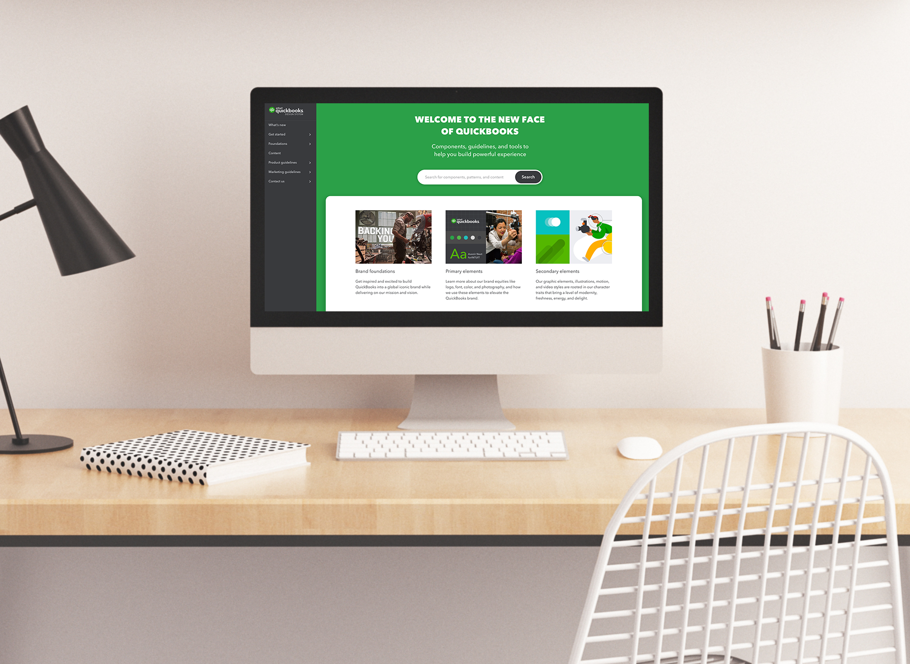
Crafting a world-class design system
Project Details
Role: I led a team of 3 designers, the end-to-end process, and the execution of the project. I worked closely with team leaders and directors on strategy, planning, process, and communication.
Process: Weekly sprints, Weekly check-in with teams, and Daily standups
TImeline: Ship all 55 critical components within 6 months and improve the experience of the QuickBooks Design System site and tools to support the new design language role out.
Background
QuickBooks is the leading accounting software product for small to medium businesses, and the cloud-based version is offered in a few product lines, such as QuickBooks Online, QuickBooks Accountant, and QuickBooks Self-employed.
The QuickBooks product recently underwent a redesign with a new design language and an overhaul of technology. As the lead designer, my role was to ensure the end-to-end success of the new visual design language product, and the rollout across our product and toolkit for our 250+ design community.
For context, our brand and product design teams led the initial redesign effort with support from our design system team to ensure the new visual design language was intuitive, simple to implement, and consume. Once the foundational elements and critical components were ready for hand-off, our team used them to scale and develop them into a design system.
As a reference to Nathan Curtis's model for scaling the Design System team, our team operates in a hybrid of a federated and centralized working model. We own and maintain the design system while bringing in outside contributions such as the new visual design language. This working model also helps our team multiply and scale our efforts. With the hybrid approach, we can lean on our community to get an idea of what’s needed across all product features, and customer needs as there are so many key players and moving pieces involved.
This is an example of what our hybrid working model looks like. The open contribution system allows for our team to bring in outside contributions to help build our design system while we own and maintain the library.
Discover:
We first needed to understand the everyday experience for our community? What was the status of our new visual design language? What components required reconciliation? What are the product team timelines? What are the current pain points?
Research:
To better understand the space, we conducted interviews and product audits to help identify the problems to ensure that we would focus our energy on the most important things. Through interviews, we learned that our community had difficulty finding the source of truth. With two visual design languages available, one new and one old, we learned that we had discrepancies across all our channels of resources, making it hard for designers and developers to determine which was correct. We knew we needed to eventually sunset the old visual design language; however, we would need to do this in a timely manner with proper planning and communication as there are many dependencies.
We needed to identify our critical mass with building our new component library. What are the key components necessary to ensure an ideal customer experience? What are the essential experiences and patterns that our customers interacts with daily? Our goal is to create the least amount of friction and ensure our product is still intuitive and familiar to our customers.
Here is an example of our community journey captured during 1on1 interviews.
Here is an example of an empathy diagram of a member from our community that we interviewed that helped us better understand the current challenges.
Problem:
The QuickBooks product teams have difficulty building the latest features following the new visual design language. They don’t feel confident in finding the proper support and resources to do their work efficiently.
Define:
To stay focused and to ensure that our team was working on the most important things, we split our work into two key tracks. The first track consisted of addressing all inconsistencies with our documentation and resources, and the second track focused on creating our new component library from design to production.
Track 1: Improving communication and resources for a more autonomous system
Communication:
To better understand our design system's current state, we leaned on our research learnings from our community. As the lead designer in the team, I managed and ran the various support channels offered to our community to ensure product teams could accelerate their work. At the same time, our team gained insights into the issues.
Documentation:
To build confidence back in our community, we needed to prioritize current pain points with our existing documentation and resources. The community could access our documentation across various resources, including our website for understanding components and patterns. Zeplin is where we shared our pixel specs, and Lingo was our Sketch Library toolkit. Finally, we used the Abstract as the primary location to store all our master working files, all of which had inconsistent guidance.
Support Channels:
Office Hours: Through Office Hours, we saw first-hand product experience and challenges that designers were facing. Office Hours also gave our team visibility into projects in the pipeline that would be going through production. We were also able to provide guidance for projects to ensure alignment with our new visual design language.
Design System Training: These training sessions were tailored to introduce our visual design language and tools to new and existing hires. Through this training, they learned the fundamentals of our design system, how we collaborate, and how to use our toolkit. Design System training is our first introduction to our growing community and allows us to build a collaborative relationship.
Design System Slack Channel: Our community channel allowed everyone to collaborate and ask questions regarding any design system-related questions. We also used this channel for feedback, announcements, and running ad hoc research such as polls and Q&A.
Community design council team: With an extensive design community to support our organization, we relied heavily on our community design council. This model allows community members from different teams to volunteer their time to contribute to our design system and to communicate news and updates back to their team. We meet with this team weekly to share and discuss projects, feedback, and to learn about current pain points and challenges they are facing.
Site Feedback Form: Our design system site also provided a more formal channel for feedback in the "Contact us" tab, where our community could send us direct messages. These messages were categorized by topic and are prioritized accordingly.
Self-service:
The ideal goal is to provide clear and concise support, guidance, and resources across all channels and build back trust and confidence so that the community can function more autonomously. This model ensured that all the support channels we provided could empower anyone to resolve most of their issues. A self-service model freed up our time to focus our energy on building our new design language components.
Track 2: Creation of new components
The second work track was specifically for creating our new visual design language components. This work track consisted of taking an inventory of our newly defined visual attributes such as spacing, color, typography, and making an inventory of UI elements, and aligning them with our existing Design Tokens.
Design Tokens are global style variables shared across all Intuit product families such as TurboTax, Mint, and QuickBooks. These tokens allowed for a much easier process for updating our components and provided continuity for customers moving between products. The Design Tokens were created and managed by our flagship Intuit Design System.
This is a diagram showing the relationship between Intuit Design System and product themes.
Accessibility:
We also ensured that accessibility standards were integrated as a crucial part of the component library creation process. We collaborated closely with the lead accessibility designer and engineer to ensure that our product could be accessed via keyboard, and screen reader, and meet at least the minimum AA contrast ratio (3:1) of WCAG 2.1 accessibility standards.
This is an example of how we test for accessibility compliance in the component design process. For tools we utilize Stark plugin for Sketch
Here is an example of testing contrast for our Page Message component. One of the challenges we had was reconciling what was already defined in IDS (Design token) and proposing changes in order to ensure they passed the minimum contrast ratio.
Develop:
As there are various contributors across our community, we needed to identify an ideal rollout redesign process that was as graceful as possible. Due to the many key teams and moving pieces, we decided to release the new visual design language in phases by prioritizing critical components within products.
Released by phases:
We decided the smoothes process would be to release components based on our phased rollout's critical experiences. We learned from our community that these essential experiences are Banking, Invoices, and Transactions, which mostly use controls and input components.
The strategy that I proposed for our team was to tackle our components in three parts. The first part included all Controls and Form elements such as buttons, inputs, checkboxes, etc. Then we worked on the Communication components such as Modal dialogs, Page messages, etc. Finally, the last phase was for QuickBooks product-specific patterns such as Tables, Drawers, etc. Breaking the components into parts made our release more manageable with our existing teams and technologies.
This is a diagram example of what key targets for prioritizing components in our library.
Delivery:
In 6 months, our team released 41 components and had 11 components in development. The components we completed addressed the majority of our product experiences. With the new component library, we were also able to make our experiences be more accessible to our customers. Tackling accessibility was extremely valuable based on our customer feedback, with a median product age of 51.
We were also able to address many documentation issues and restore confidence in our community. We fixed many discrepancies with our documentation and aligned them to our new visual design language. We improved communication with our community by providing transparency through our process and establishing a monthly release announcement. Our efforts with improved documentation led have led to at least 90% adoption of our new visual design language in our product.
The component status page allowed our team to communicate back to our community on the status of our library.
Here is a visual example of some of the final deliverables of our new component library.
This is a view of our toolkit created through Lingo app that enables our team to push new updates to the community.
From the left is our main dashboard for QuickBooks Online and the right is with the new components and new visual design language.
Here is a look at the update from our QuickBooks Self-Employed product with our new responsive grid.
Challenges and constraints:
Our team faced many challenges, given the magnitude of the project and the scale of our team. The biggest challenge was ensuring our team would be adequately staffed. In the beginning, we were short on a few key members to help drive our components' production to the finish line, such as a Content strategist and Engineers. We had designed new components that were ready for documentation and implementation but only had one dedicated engineer and no content support. Our design team had to double up and write our content and leverage Content Office Hours to resolve this gap. We had to advocate and borrow engineers from another team and get buy-in by aligning our roadmaps and sharing our resources.
We had to set MVP goals from the component design aspect, especially with identifying responsive behaviors. We also ran into a few roadblocks with dependencies between components that increased the design process's scope.
Another challenging aspect was working in tandem and managing all the moving pieces, such as aligning with our Design Tokens while changes were happening live.
Final thoughts:
Despite the challenges we faced, this was a big win for our teams and our customers. With the new visual design language rollout, our product experiences have improved, including user experience, accessibility, and performance.
Our 250+ design community became empowered and now had the tools necessary to build and contribute to our new visual design language. Teams could gain speed to benefit by reusing proven components to accelerate their product production process.
Visit the website here
More case studies
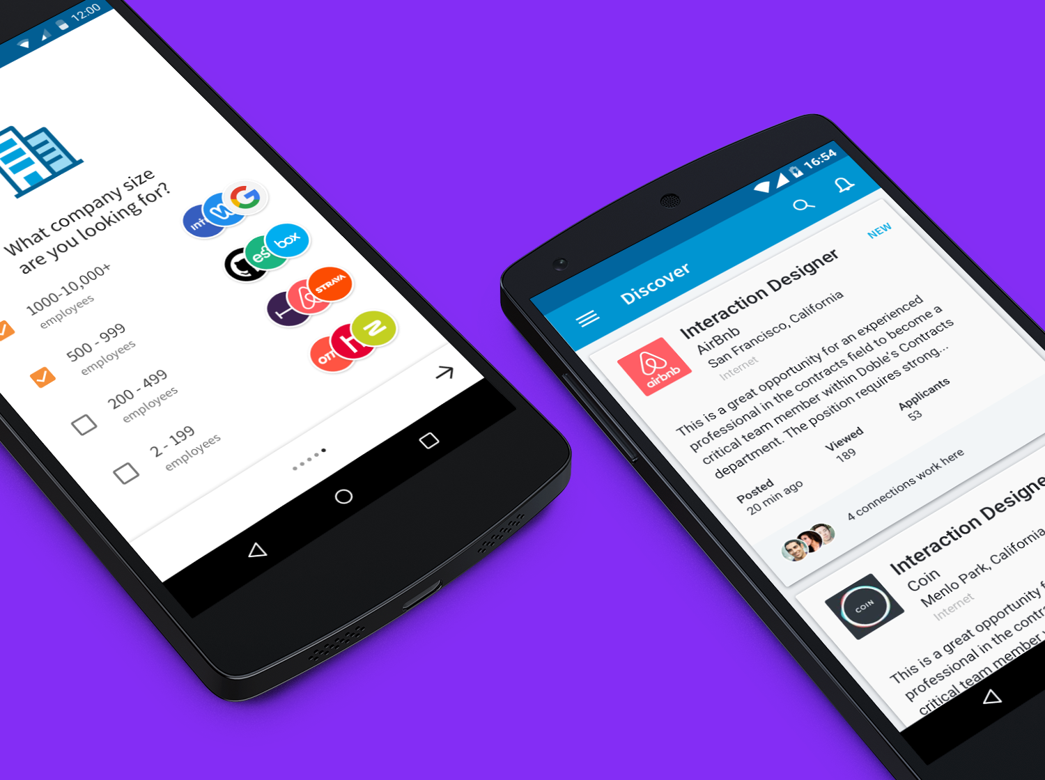
LinkedIn Jobs App discovery feature
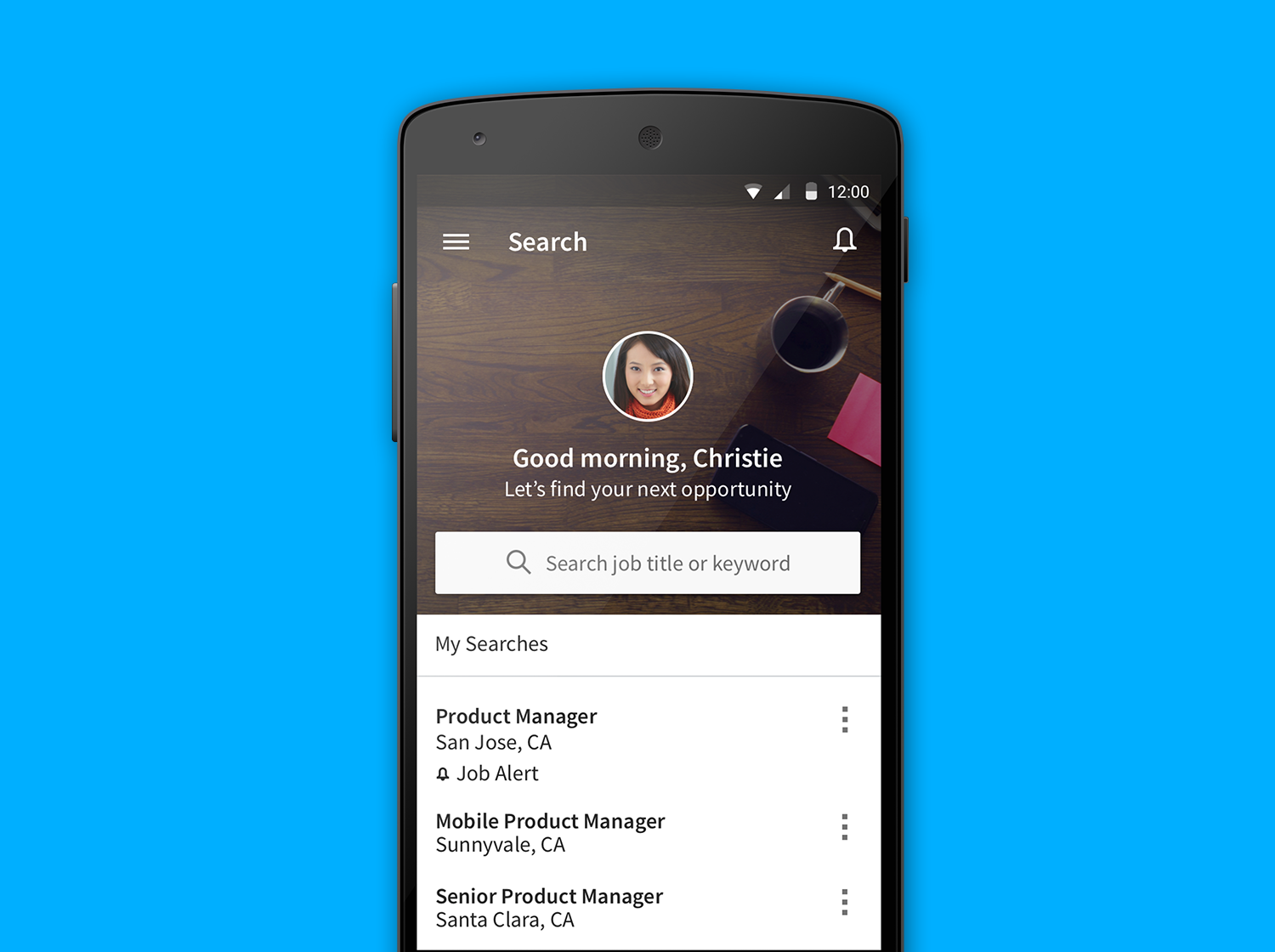
LinkedIn Jobs App Redesign
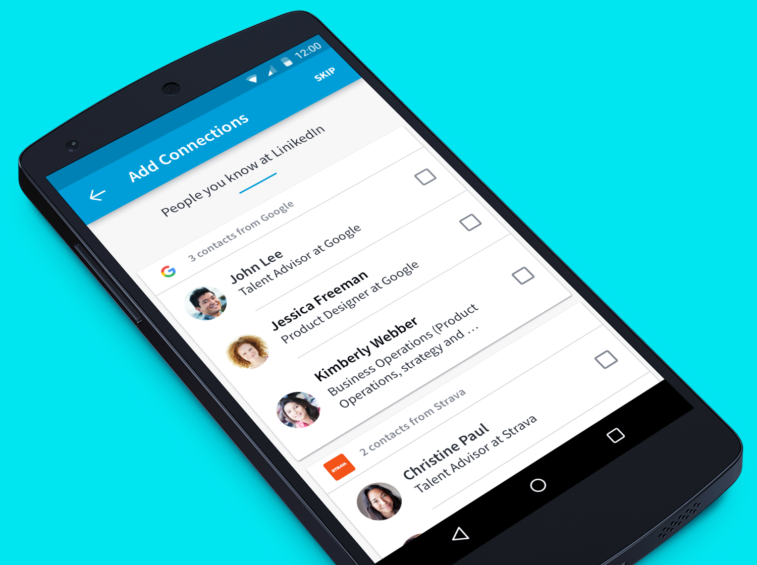
LinkedIn Jobs App address book import feature
© Copyright 2021, Stevenpixels. All rights reserved.