
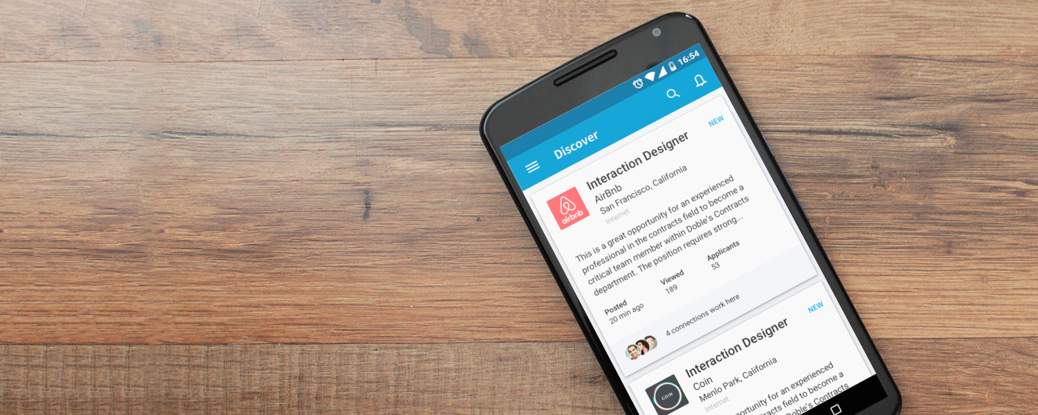
LinkedIn Jobs App discovery tab
Project Details
Role: I was the sole designer and led the end-to-end design. I worked closely with 1 product manager, 5 engineers, and 1 UX researcher.
Process: Bi-weekly sprints, Bi-weekly check-in with Design and Engineer, and daily standups
TImeline: Shipped MVP in 6 months
Background
After the first release of the LinkedIn Jobs app, we interviewed 9 of our members. What we discovered was that majority of our active LinkedIn job seekers don’t just apply for jobs they do more. Our active job seekers also network, follow companies and keep up to date with current events.
This led us to believe that Job searching is not just about finding jobs. It's about research, networking, and keeping up to date with current events. To bring the best job search experience to our members, we wanted to replicate this experience for our Discovery tab in hopes to bring more value to our members.
“…active LinkedIn job seekers don’t just apply for jobs”
Here is an example of how one of our job seekers track their job search.
Assumptions
Active job seekers don’t just apply for jobs. They network, build their connections, follow companies, and read content to improve their chances of getting a job.
Job seekers want help and don’t know what to do when they exhausted all their resources.
Timeline and Process
Here is a look at the teams that contributed to this project. Note that the timeline includes both the LinkedIn Job Search App redesign and Discovery feature. Also note, in order for our team to achieve the timeline for both iOS and Android both Design and Engineering had to work in tandem. For this project, I collaborated with the Product Operations, Product Manager, Research, Engineering, Marketing, and Design System team.
Research
We knew we wanted to personalize our members' experience and give them more control. Our goal was to understand our targeted market—the active job seekers. We wanted to learn about their current impression of the LinkedIn Job Search app and their job search behavior. Our journey led to testing nine LinkedIn Jobs app members who were actively job seeking.
What we found was that they were often not aware of the Discover tab in both iOS and Android platforms. However, if they were aware, they did not understand the difference between discovery and their search results. Also, the members who did know the value of the discovery tab still felt the need to run a search to ensure that they had exhausted their options.
What we learned from our members
The experience that we had for our members was not engaging, and they had difficulty understanding its value. What we had was two separate lists of job recommendations leveraging LinkedIn's job algorithm which we called "Based on your viewing history" and "Popular among people like you." In user testing, some members had difficulty understanding the difference between the jobs in discovery versus their search results.
Example of existing Discovery tab of the app. Recommended jobs are surfaced in only two categories and appear through scrolling of the page.
Daily recommendation concept
The initial proposed concept structured around the idea of surfacing daily recommendation cards of various entities to guide members to be more active as job seekers. In addition, we share insights into each recommendation.
An early example of discovery card concepts highlighting key entities such as Jobs, Content, Companies, and People.
This was an early wireframe of the cards to help communicate the idea to my team.
Learning about best practices
Sharing preferences is a common pattern for onboarding in mobile that allows more customization in the product experience. However, it requires high interaction cost and a lot of effort from a user. From my findings, I couldn’t determine what is the ideal number of screens recommended. There was also no common pattern for displaying content. However, I did find some easier to comprehend than others.
My general takeaway from this to help guide my design:
Have a clear welcome message
Always have a clear progress indicator
Make content action-driven to nudge users forward
Give recommendation if data is available
Keep content short and simple
Allow the user to skip
Show a clear end message
Understanding member preferences
The first test was to understand our member preferences. The initial design was based on our current desktop job preferences experience in what we call "Custom JYMBII (Jobs You May Be Interested In)." However, we wanted to get an understanding as to how our members would react to setting their own job preferences and whether or not they would correlate the job recommendations to the preferences they set. We also wanted to test the idea of a daily set of recommended cards. We were hoping this would help create a sense of "New." Since this was a test on our members' job preferences it was essential that we customized our prototypes and mockups so that they would feel realistic for each individual. Below is an example of the experience that we tested.
An onboarding experience we used for user-testing to understand our member's expectations.
Example of recommended cards presented to members after they share their job preferences. This is what we used to test a prescriptive experience.
Research learnings
Through our test, we learned that "New" jobs were the most important to our members. When presented with the job preferences experience our members knew instantly that their feedback in this area would correlate to a more improved experience within the app. Also, they were happy and had a high tolerance for answering the questions presented as they knew the more questions answered, the better their experience would be.
“Every day is different; sometimes I want to search some days I want to browse.”
When presented with a set of recommended daily cards, our members understood the value of each card (Job, Company, People, and Article). However, what was most important to them was the jobs. We learned that the stage they were in with their job search influenced their level of engagement between each of the cards. Our members had opposition to the concept of daily recommendations. Many feared they were missing out on jobs and wanted to see more jobs. Also, they did not like the idea of a prescriptive experience.
Creating context for preferences
One important decision we made was where our first-time members would set their preferences. Upon first launching the app and entering the Discovery tab, they were presented with a null state to begin setting their preferences. After they completed their preferences, they would return to the Discovery tab with their new feed. We found this to be the best strategy as it gives members context as to how their feeds relate to their preferences. We also had an easily accessible entry point to preferences on the settings page.
Final design for members to share their job preferences.
Revisiting Designs
With a new lens from our learnings, we made the decision to move away from a prescriptive experience and a full-screen card-based layout. Our new design opted for a feed due to it's versatilily and ease of use. The feed design allowed us to fit more content on a screen and through user affordance, our members can scan and parse the information quicker. Our new design also omitted the primary call to action button within each card. In both desktop and mobile research, we found that action buttons for our card-based layout engagement were low because members had a hard time taking actions without first reviewing what is inside the content. Many of our members were weary of the results when they engaged with the buttons at this level of the experience. One important decision we made was where our first-time members would set their preferences. Upon first launching the app and entering the Discovery tab, they were presented with a null state to begin setting their preferences. After they completed their preferences, they would return to the Discovery tab with their new feed. We found this to be the best strategy as it gives members context as to how their feeds relate to their preferences. We will also have an easily accessible entry point to preferences on the settings page.
Example of key recommendations are Jobs, Content, Companies, and People.
Learning from our members
We gave our members the ability to take control of their recommendations by swiping away unwanted content from the feed. Learning from our member's specific behaviors allowed us to improve our recommendation algorithm.
The discover card allows the member to give feedback to a particular recommendation by swipe gesture.
Job preference (Onboarding) Prototype
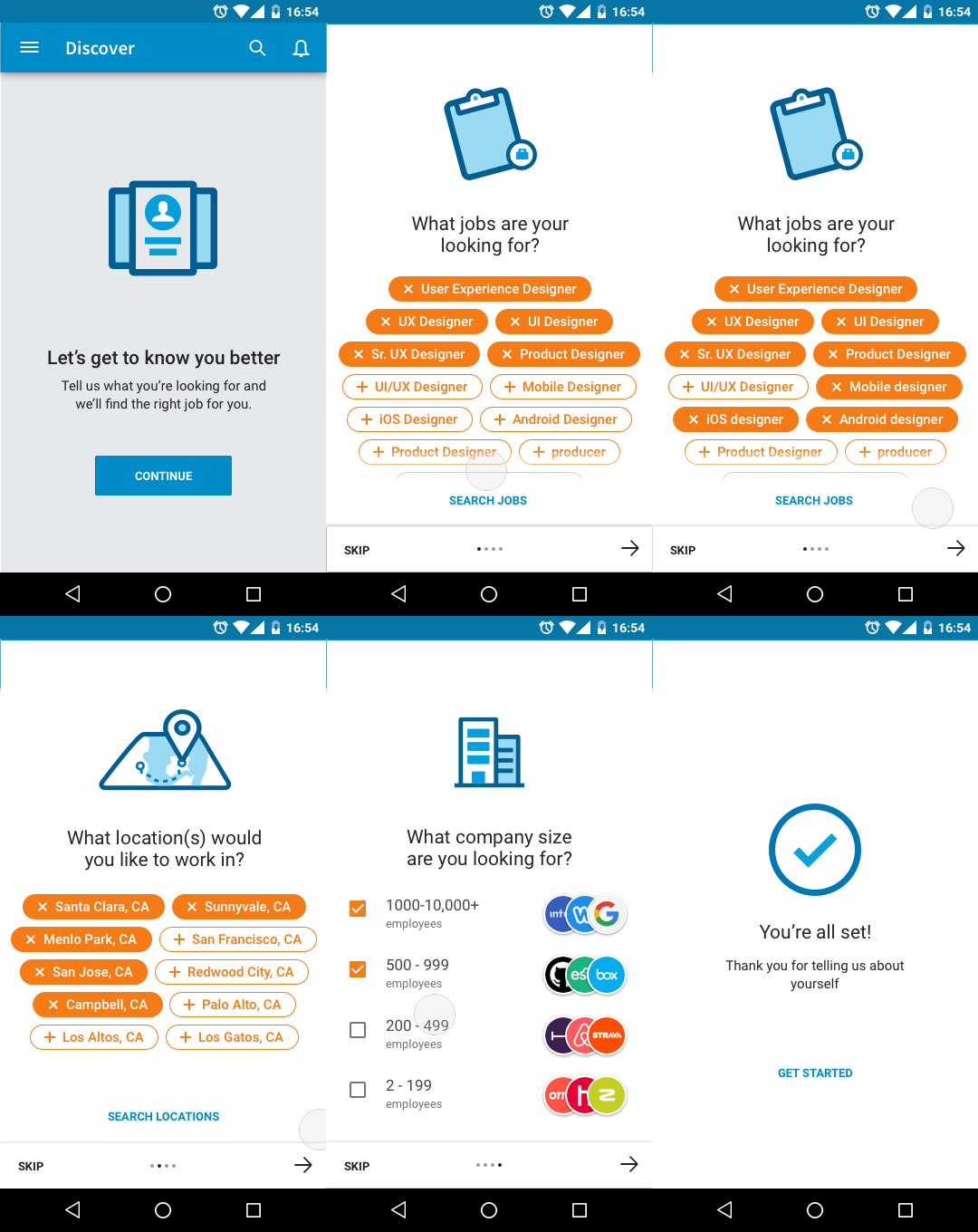
Here is an example of the job preference experience that help improve our member’s discovery recommendations.
Discover Experience Prototype
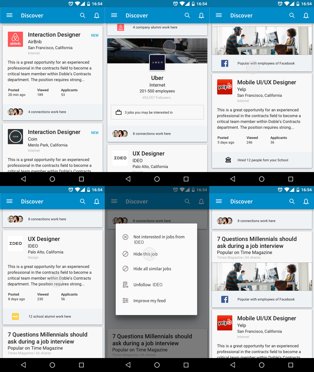
Here is an example of how the experience looks like with the delete function.
Download the app on Google Play Store or iTunes
More case studies
Crafting a world-class design system
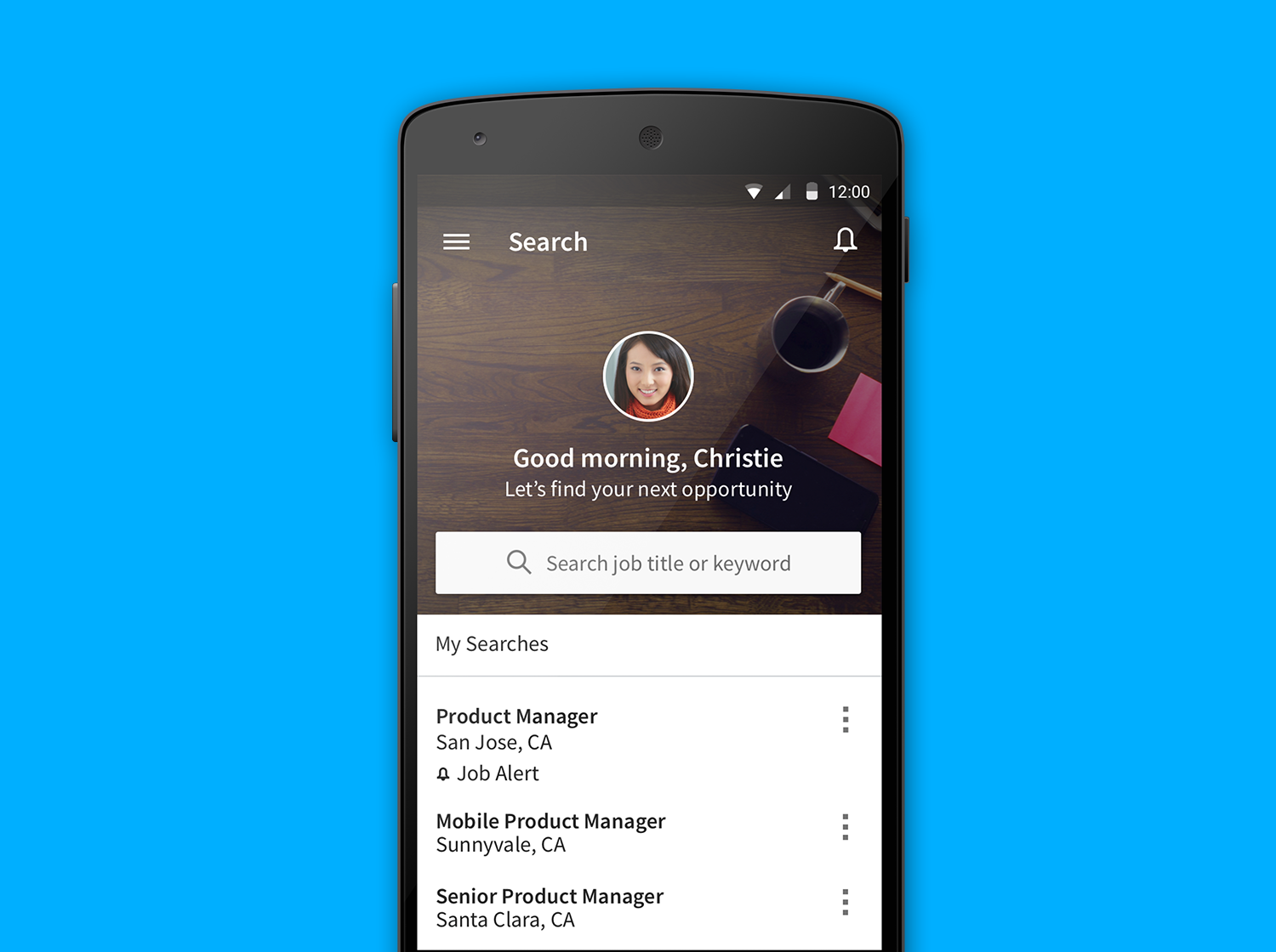
LinkedIn Jobs App Redesign
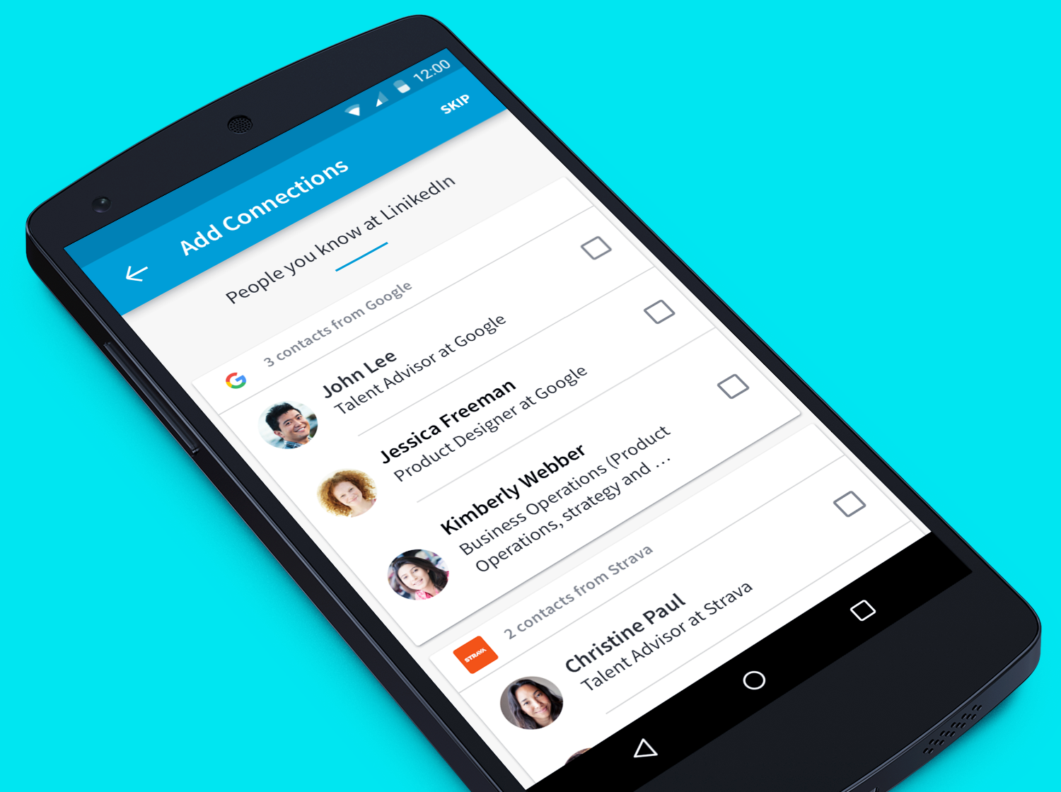
LinkedIn Jobs App address book import feature
© Copyright 2021, Stevenpixels. All rights reserved.